"Monsieur Brasserie de la Senne" // Jean Goovaerts and the art of beer labels
You may never have heard of Jean Goovaerts, but if you have gotten drunk in Brussels in the last decade, then you will know his works. On beer bottles, pump clips, and posters, his artwork for Brasserie de la Senne is all over the city. Even sitting in Cafe Le Coq, nursing a Bruxellensis and waiting for him to arrive, his Brasserie de la Senne sunrise logo is plastered on my glass. His blocky, colourful, and idiosyncratic designs are central to Brasserie de la Senne’s identity, its rise to prominence, and the brewery’s success abroad.
And, as Jean tells it, his involvement in the brewery all came from a family emergency.
A family affair
“Actually, it wasn’t meant to be,” says Jean when he arrives. In 2005, he was working as a cartoonist and a teacher at a school in Brussels when he was approached by Bernard Leboucq, one of the co-founders of Brasserie de la Senne and, in the way of these things, Jean’s cousin.
“Bernard came home and said to me ‘Okay, the Americans asked me to do something in colour’. He was already doing his own labels by himself. It was very crafty, basic,” Jean says. Shelton Brothers, De la Senne’s US importers, wanted them to professionalise. “And so, he asked me ‘I’m in a mess, you need to help me!’” Several hours, and several bottles of Cantillon later, they had created the label for Zinnebir. As Jean tells it, the design just came to them: “We didn’t talk about ‘branding’. It was a kind of automatic drawing.”
“I don’t remember asking ourselves if it was going to be art deco. It’s just our idea, it’s just the kind of thing we like, basically, since we were little”
His design process has remained more or less unchanged since, the only major difference being that now the circle of people involved in reviewing labels has expanded beyond the original trio of Jean, Bernard and fellow-founder Yvan De Baets to include all the brewery’s employees. The automaticity is still there. “There was no overthinking. There is no overthinking because there is no time. I get the information, [that] we need a new label in five days, okay I have five days to do it. You do the first draft, it’s validated...We don’t have time to go for a style.”
"Art Deco was obvious"
He might claim that they have no time to think about style, but de la Senne labels are unmistakable in their design and their expression of Jean’s influences. “Art deco was obvious,” he says. “I don’t remember asking ourselves if it was going to be art deco. It’s just our idea, it’s just the kind of thing we like, basically, since we were little.” He animatedly rattles off artistic touchstones. Picasso and the interwar avant-garde. Russian Suprematism. Alexander Rodchenko, and his wife Varvara Stepanova – “there is not even a book about her”. 1920s posters for Catholic youth organisations – “totally badass!”. Lucien de Roeck, the designer of the Brussels Expo ’58 star logo.
Clearly visible in his designs for de la Senne are his background as a cartoonist, and his relationship with Brussels. As well as being educated at the Saint Luc art school in Brussels, Jean worked for a time on animated cartoons and with Brussels cartoonist Philippe Geluck, best known for “Le Cat”. He singles out French cartoonist Yves Chaland for particular praise – “graphically, he is a master”.
Chaland was a proponent of the Ligne Claire (“clear line”) style of drawing, pioneered by Hergé in his Tintin comics, and was the creator of Le Jeune Albert, a comic set in 1950s Brussels. Chaland’s work on this and his portrayal of Brussels was, according to Jean, “…amazing. It was totally aggressive, in a good way, it remembers our dark side, collaboration, colonialism.”
"Don't be attached to anything in Brussels"
Brussels plays a large part in Jean’s designs too. The silhouette of the Senne river, the Atomium, and Brussels dialect have all featured prominently. Born in Brussels’ Etterbeek neighbourhood, he has seen the city change and transform around him.
“Don’t be attached to anything in Belgium,” he says, remembering how in his youth whole neighbourhoods in Etterbeek vanished. “That’s the thing in Brussels, you can’t grow up here in Brussels and say everything will be fine. Maybe!
“I’m born here, yes sure, and maybe tomorrow I will be there, maybe I will be dead, maybe the ground will collapse.
“It‘s also in the identity of the label, a certain despair.”
Each of these influences – and what Jean describes as a de la Senne “a twist, a subversion” – are present in the brewery’s most well-known label: Taras Boulba. The label features a father about to kill his son, against the backdrop of a fairground, and Brussels’ town hall. The father towers over the son with a barrel in his hand and calls him a “smeirlap”, fool or idiot in local Brussels dialect.
Taras Boulba - inspiration from unusual places
The scene is lifted from an eponymous 19th century novella by Russian writer Nikolai Gogol. “Bernard came with the idea of Taras Boulba because he was…fascinated by the book,” says Jean. In the original story the protagonist was Ukrainian and his son falls in love with a Polish girl. “Bernard said, ‘We are going to do a Belgian version. Okay, the son is going to be a married to a Walloon girl!”
“It‘s also in the identity of the label, a certain despair.”
Concept in place, they went to work. “We first did something very…bubbly, it made no sense. I remember my girlfriend looked at it and said, ‘yuck’.” Jean and Bernard regrouped, and reached for a new source of inspiration.
And they found it in Picasso’s Guernica.
“We took the painting of Picasso of the city in the Basque country – Guernica – and we, and together, we said, ‘Ah, something like this!’” says Jean. “We took Guernica, and we looked. We closed the book, and okay, it was on. It just came like this. We didn’t think.” Look at the outreached, crinkled fingers, the silent wail of the son’s face in Jean’s Taras Boulba. Different context, smaller scale, but the despair is the same.
Not all of his label designs have been so successful, by his own admission.
"I was crucified"
“The worst example is maybe the Zwarte Piet,” he says. He is referring to the controversy that erupted around the design he made for de la Senne’s Zwarte Piet black IPA.
The original label depicted a cartoonish black character in safari gear, echoing historical racist depictions of African people. The name Zwarte Piet on its own is freighted with cultural and historical baggage in Belgium and The Netherlands, as both countries have been confronted with their colonial histories in recent years.
“I got crucified,” he says. “We wanted to make a kind of Tintin. It’s a kind of clin d’oeil [wink] to Tintin, actually.” But, as Jean admits, it did not go down well in some quarters. “I’m the first to admit that it was a good learning experience,” he says. “If I had to do once more, I would do differently.” And, having received the negative feedback particularly abroad, they were quick to withdraw and replace it as Brusseleir Zwet IPA, now with a rocket man as less divisive main figure.
Taras Runa - an old favourite
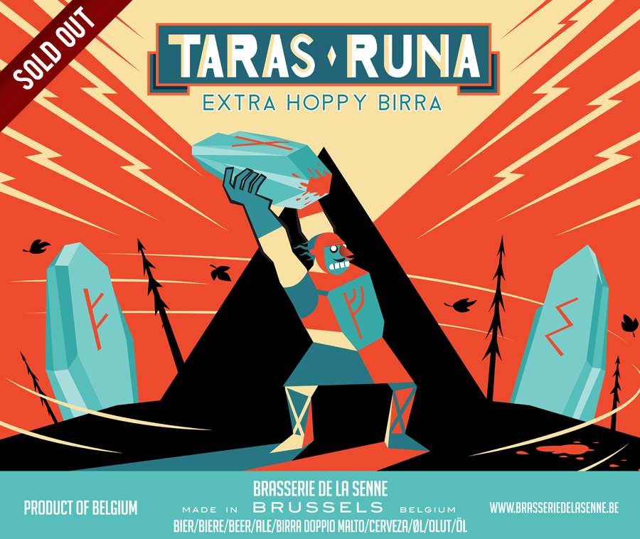
A new round of Zinnebirs ordered, we dive in to the bundle of old sketchbooks Jean has brought with him. The pages are crowded with character sketches and concept art for almost- or never-finished labels. Over fifty labels later, does he have a favourite? “Some years ago I was pretty fond of the Taras Runa we made with an Italian brewer [Birrificio di Montegioco]. I would like to say the next one…it’s always fun to say, let’s do something and surprise myself.”
““I’m Monsieur Brasserie de la Senne, I’m nothing else right now. And that’s good.”
We gossip a little about the Brussels beer scene. Jean has brought with him as a gift a bottle of de la Senne’s Crianza II, the subject of recent hostilities between Moeder Lambic and the brewery.
This conflagration aside, he’s encouraged by the state of brewing in Brussels, and by some of the design work of the new breweries. “I was pretty happy when I saw the work from L’Ermitage, [the artist responsible for their labels] Krump*, it’s very nice work,” he says. “I love the Jodorowsky, the alchemist [a character from Jodorowsky’s The Holy Mountain]. It was fun to see something different. There is a kind of distance, a kind of stupide – the good kind! I was pretty happy to see that in my own city,” given what he sees as a lack of creativity around labels in Belgium for many years.
Jean Goovaerts has done as much as anyone to spur on this new creativity in Belgian beer, even if he himself was not even sure it was going to work out in the beginning: “Everybody said, ‘Oh, you’re working for a brewery? In Belgium? Good luck!” Over a decade later, he is happy to stay in what he calls the best job he’s ever had.
“I’m Monsieur Brasserie de la Senne, I’m nothing else right now. And that’s good.
“It could be worse! I could be only Monsieur Zwarte Piet!”
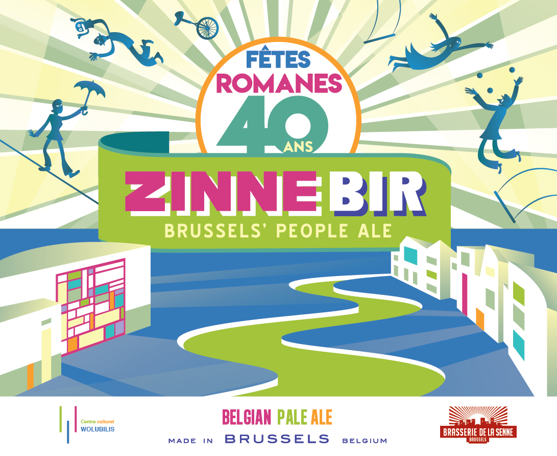
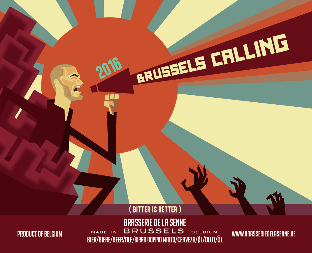
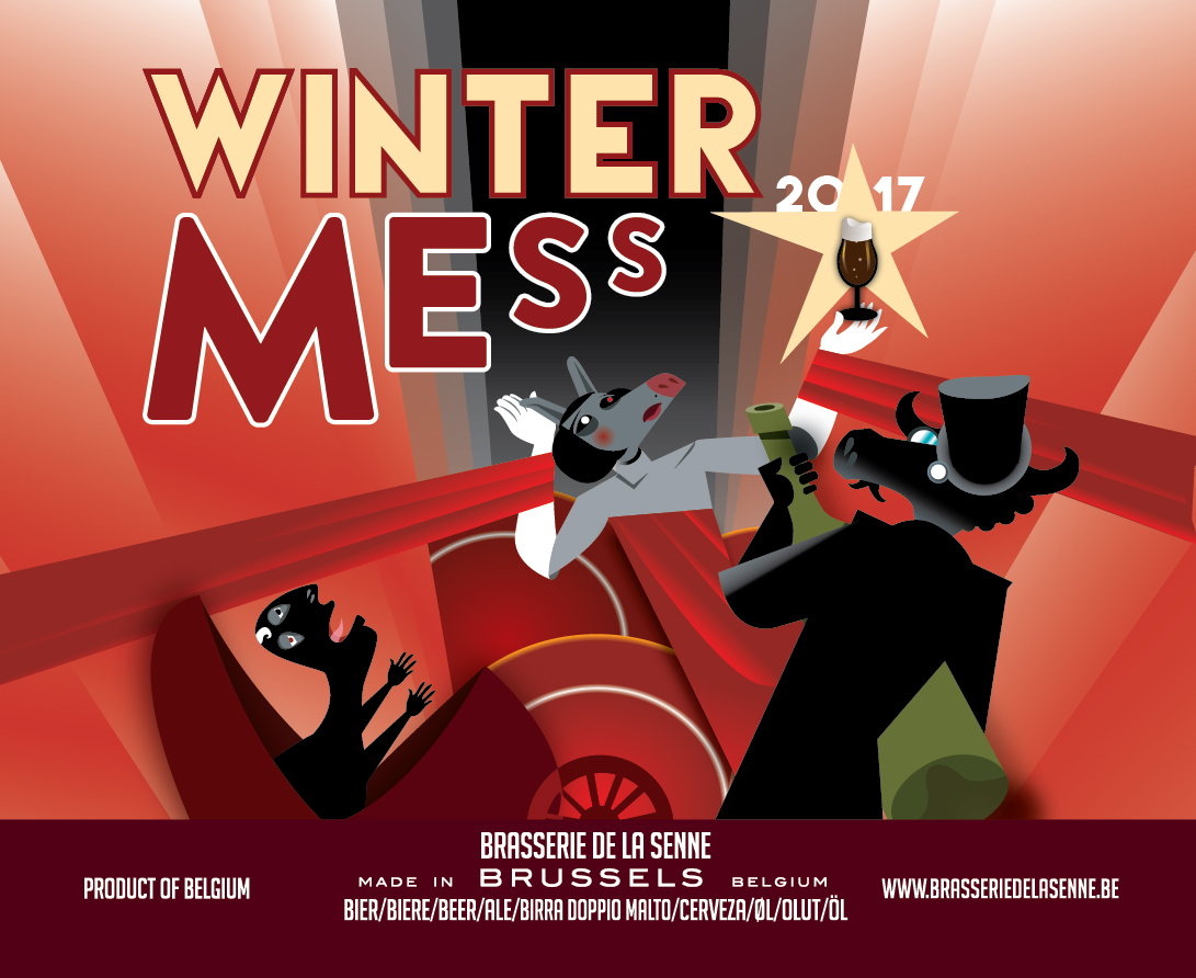
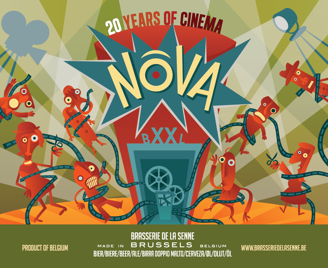
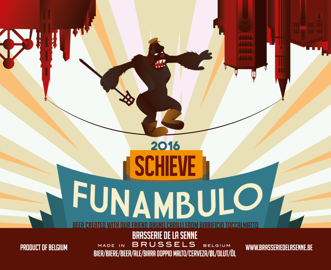
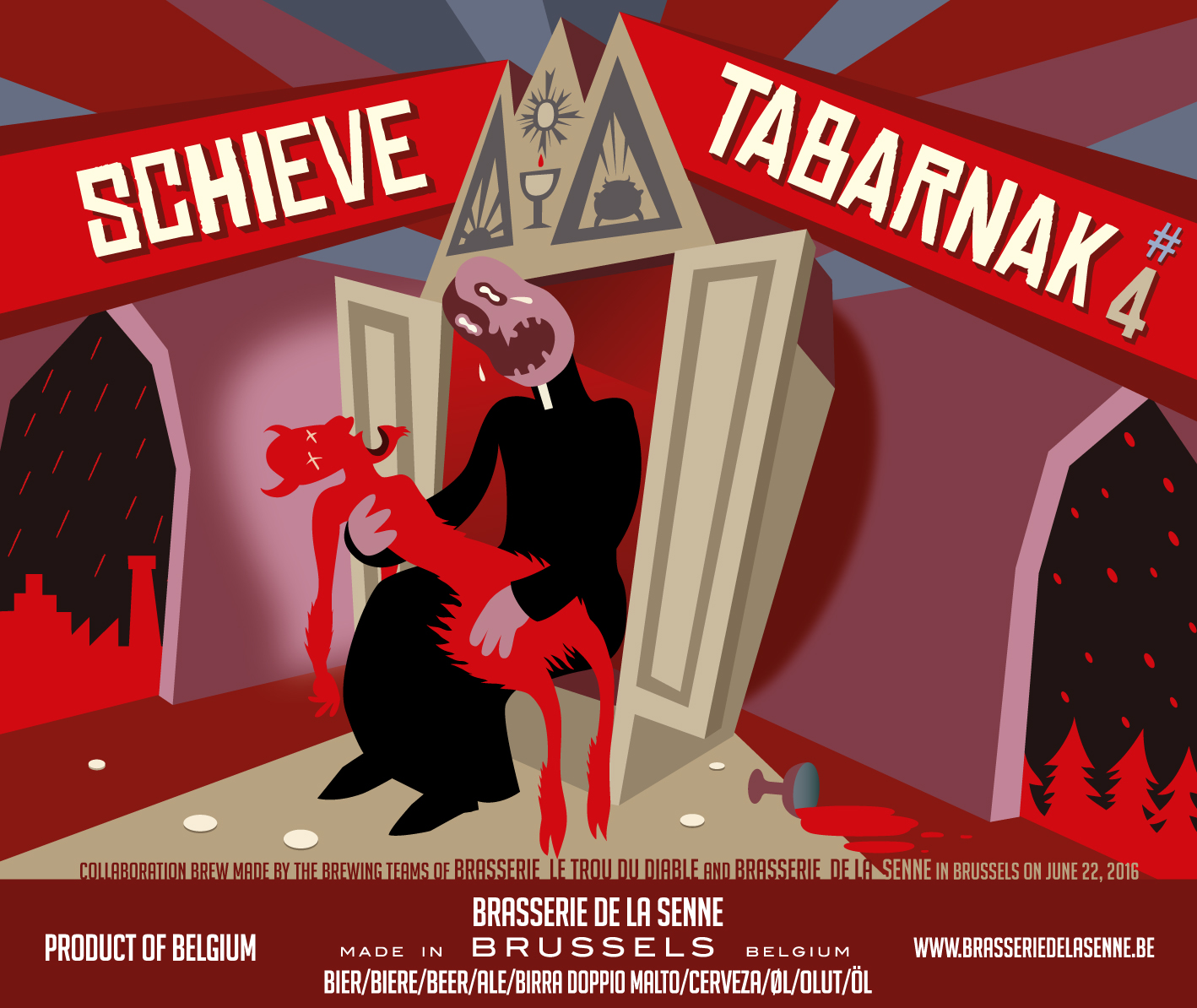
Lesser-spotted de la Senne - a selection of obscure Brasserie de la Senne labels
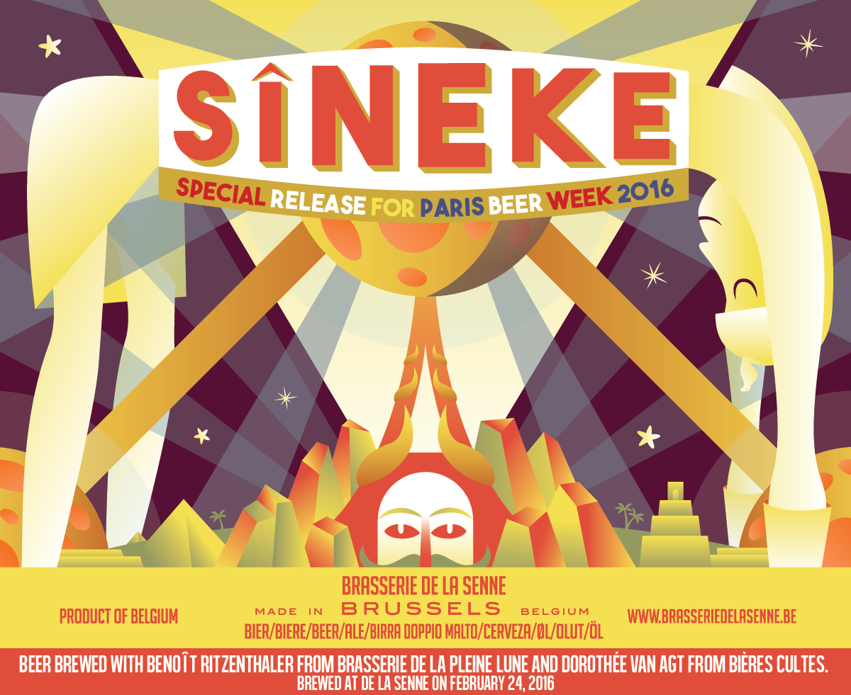
*Krump is also the designer of this site's logo.
